Identity & TYPE DESIGN
The Unchosen Fork
Details
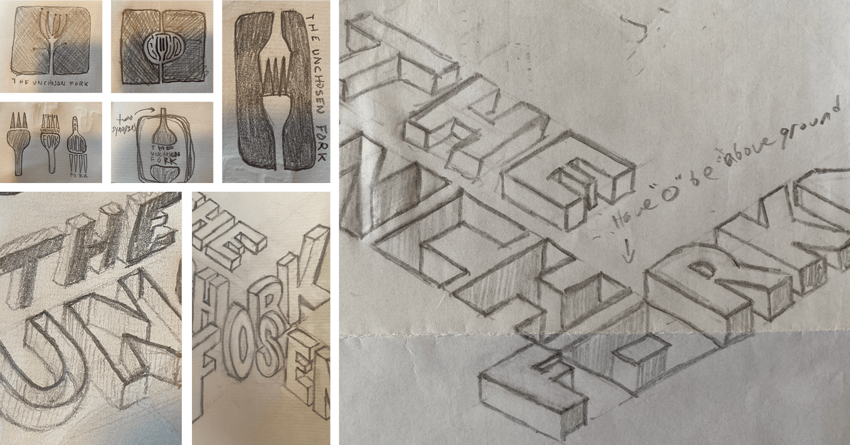
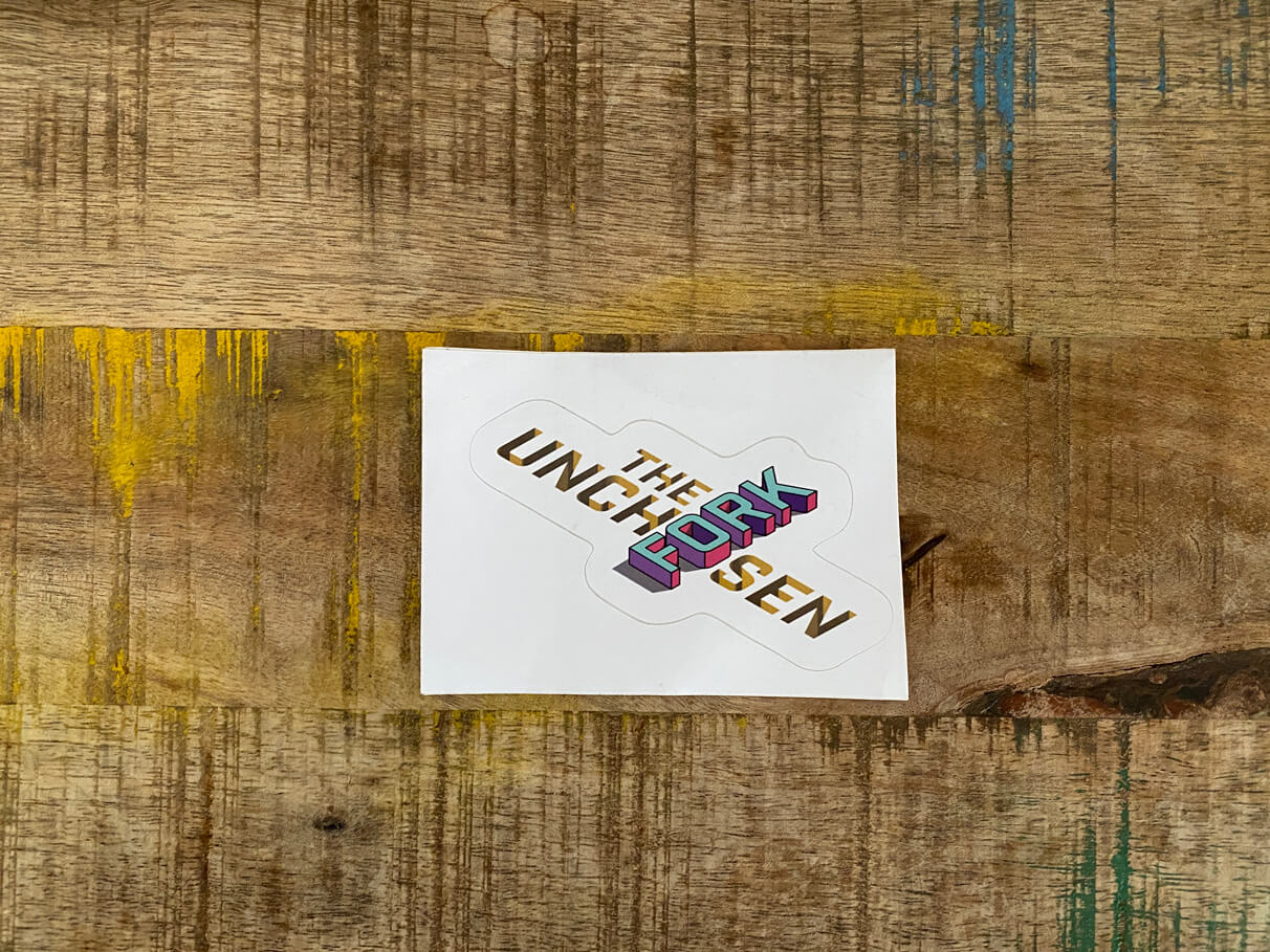
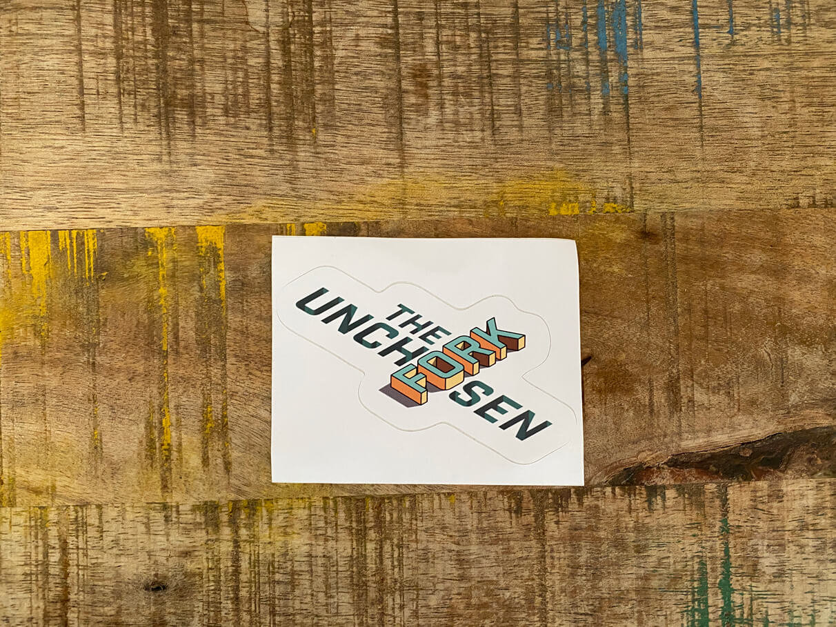
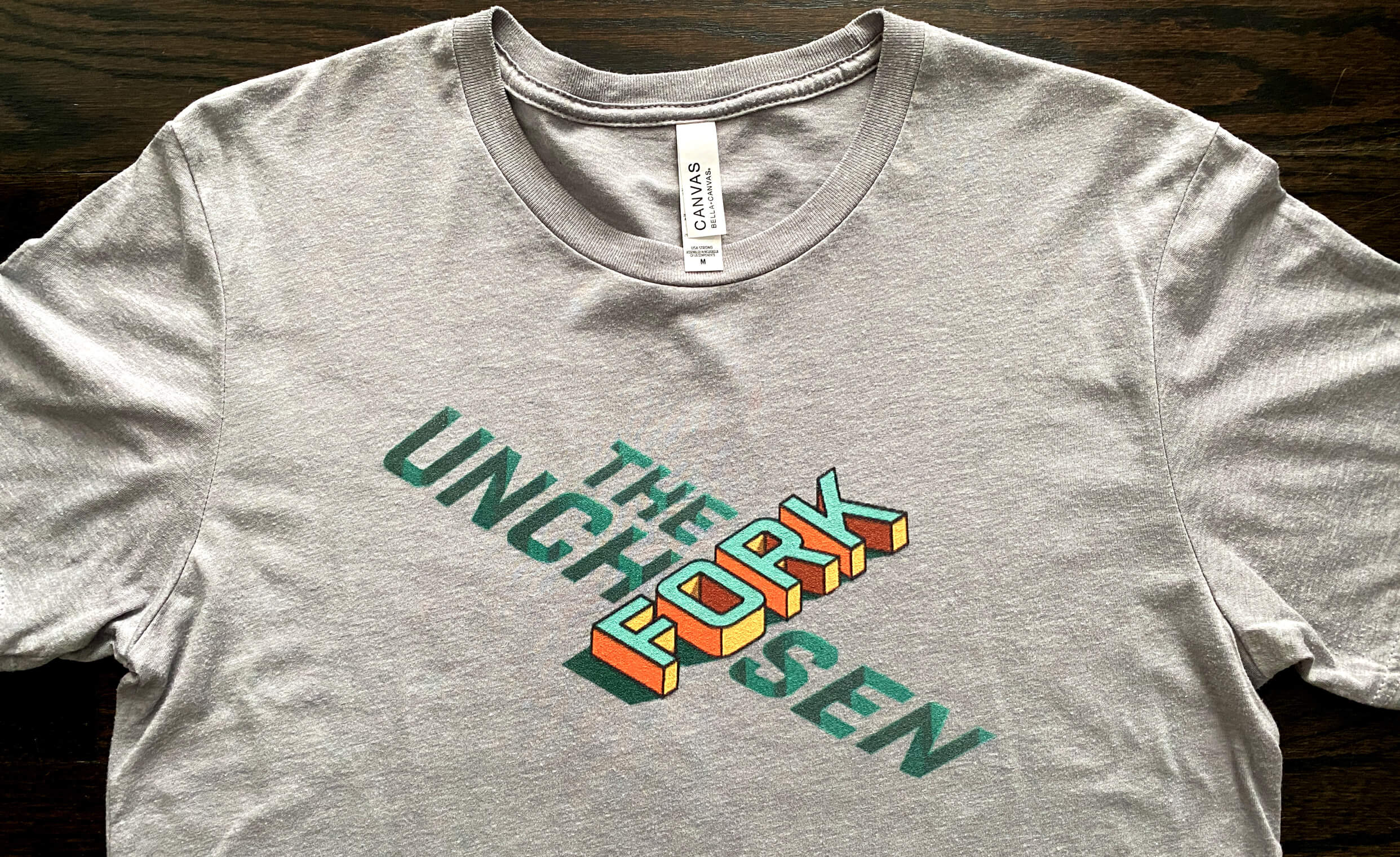
A friend of ours asked if we could help brand their podcast, and without hesitation we said yes. The Unchosen Fork is a podcast about reclaiming your life, health, and sanity during illness. The idea behind the name is super clever (which we can't take credit) - when diagnosed with an illness you must change your life of mostly things you wouldn't choose to change like what you eat. That's where the Unchosen part comes from in the name. The Fork is relating to a fork you eat with but also a fork in the road - choosing a different path or a path choosing you.
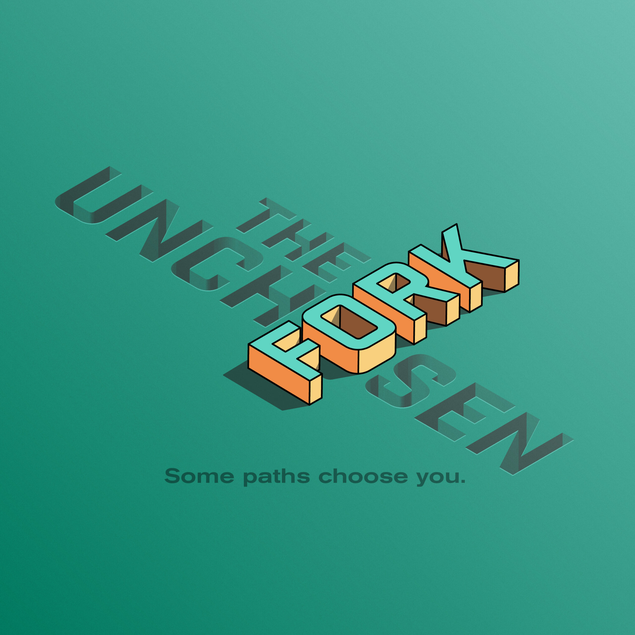
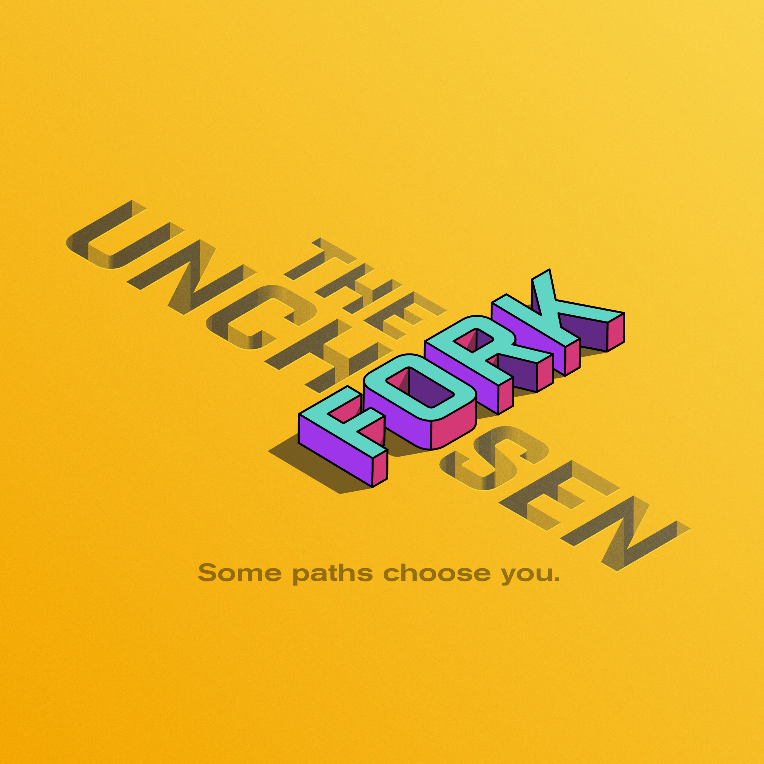
Our idea started with creating a design that expressed a 2-sided feeling about a diagnosis - the positive and negative - the darkside and the lightside - the abyss and the path forward. The 'Unchosen' part of the diagnosis is the dark, abyss and the 'Fork' is the light, path forward. With a simple type design we created a shadow on the 'Unchosen' type signifying the sun setting and an opposing shadow on the 'Fork' type signifying the sun rising. Also, the 'Unchosen' type is set into the ground as the 'Fork' is raised above to further the positive and negative energies.
Role
Design & Illustration
Client
The Unchosen Fork
Year
2021
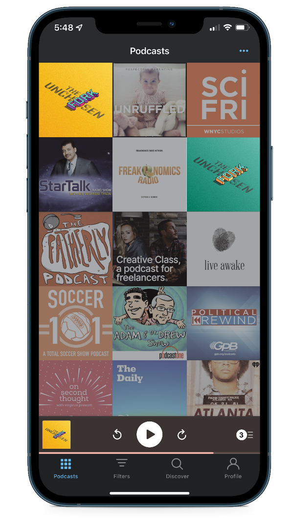
The final: PODCAST COVERs
The client was so delighted with the final designs, they decided to make stickers and t-shirts out of them. We're glad we pushed this design further than the first couple of sketches. The first sketches can create a false positive, allowing us to feel a sense of completion but it's when we push the limits that a truly extraordinary design emerges.
MERCH
Stickers and t-shirts.
DESIGNer/Illustrator
Chad Phillips